
Colors have a profound impact on our emotions, behaviors, and overall well-being. When it comes to interior design, selecting the right color palette can transform a space from mundane to inspiring. By understanding the psychology of colors, you can create a home that not only reflects your personality but also enhances your mood and lifestyle. Here’s a comprehensive guide to choosing the perfect palette for your interiors.
1. Understanding Color Psychology
Color psychology is the study of how colors influence human emotions and behaviors. Different hues can evoke specific feelings—some energize and inspire, while others calm and soothe. For instance:
-
Warm colors (red, orange, yellow) are associated with energy, warmth, and passion.
-
Cool colors (blue, green, purple) evoke calmness, relaxation, and serenity.
-
Neutral colors (white, gray, beige) offer balance and versatility.
Understanding these basic principles is the first step in crafting a harmonious color scheme for your home.
2. Assess Your Space and Goals
Before choosing colors, consider the purpose of each room and the emotions you want to evoke. For example:
-
Living Room: A welcoming and social space may benefit from warm, inviting tones.
-
Bedroom: Opt for calming colors like soft blues or muted greens to encourage relaxation.
-
Home Office: Boost productivity with energizing yet balanced shades such as light yellow or soft gray.
-
Kitchen: Stimulate appetite and warmth with earthy tones or vibrant shades like orange and red.
3. Popular Colors and Their Meanings
To make informed choices, it helps to know what each color represents:
-
Red: Bold and passionate, red is perfect for adding drama but should be used sparingly in smaller spaces.
-
Blue: Calming and trustworthy, blue works well in bedrooms and bathrooms.
-
Green: Associated with nature and renewal, green brings balance and freshness to any room.
-
Yellow: Bright and cheerful, yellow can energize spaces like kitchens and work areas.
-
Purple: Luxurious and creative, purple adds sophistication to living rooms or bedrooms.
-
Gray: Neutral and modern, gray serves as an excellent base for contemporary designs.
-
White: Pure and clean, white creates an open, airy feel but can feel stark if overused.
4. Create a Cohesive Color Scheme
A cohesive palette ties your entire home together. Use the 60-30-10 rule as a guideline:
-
60% Dominant Color: This is the primary color used for walls or large furnishings.
-
30% Secondary Color: A complementary shade for furniture, rugs, or curtains.
-
10% Accent Color: Bold pops of color in decor, pillows, or artwork.
5. Consider Lighting
Lighting plays a crucial role in how colors appear. Natural light enhances colors, while artificial lighting can alter their hues:
-
North-Facing Rooms: Cooler light; warm tones work best to balance.
-
South-Facing Rooms: Warm, abundant light; both cool and warm tones work well.
-
Artificial Lighting: LED and incandescent bulbs can change how colors are perceived. Test paint samples under different lighting conditions before committing.
6. Incorporate Color Trends
While timeless palettes are always a safe choice, incorporating current color trends can keep your home feeling fresh. For 2024, expect to see:
-
Earthy Greens and Browns: Inspired by nature and sustainability.
-
Muted Pastels: Soft lavender, dusty pink, and pale yellow for a subtle charm.
-
Bold Accents: Deep teal, terracotta, or burnt orange for a dramatic touch.
7. Experiment with Textures and Patterns
Color isn’t just about paint. Introduce variety through textures and patterns. For example:
-
A neutral sofa with colorful throw pillows.
-
Textured wallpaper with subtle metallic hues.
-
Rugs, curtains, and bedding that incorporate complementary shades.
8. Balance Personal Preference with Practicality
While it’s important to choose colors you love, consider practicality as well. High-traffic areas like kitchens or hallways may benefit from darker, stain-resistant hues, while soft tones work well in low-maintenance spaces.
9. Test Before You Commit
Before committing to a color, test it in your space. Paint small swatches on your walls and observe how they look at different times of the day. This step ensures that the colors resonate with your vision under varying lighting conditions.
10. Hire a Professional If Needed
If you’re overwhelmed by choices, don’t hesitate to consult an interior designer. Professionals can help you create a cohesive palette that aligns with your style, goals, and the architecture of your home.
11. Tips for Specific Rooms
Here are some tailored suggestions for popular spaces:
-
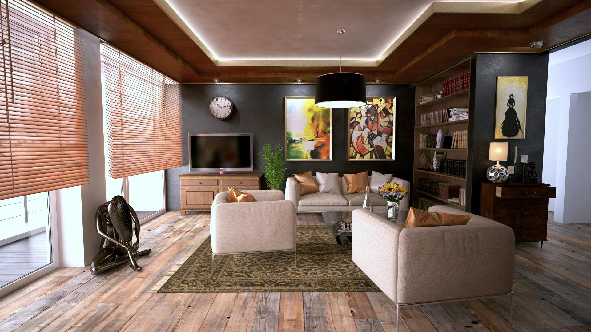
Living Room: Neutral walls with colorful accents like an orange armchair or blue artwork.
-
Bedroom: A soothing palette of light gray and soft lavender for a serene retreat.
-
Kitchen: Earthy green cabinets with white countertops for a fresh, modern vibe.
-
Bathroom: Cool blue tiles paired with white fixtures for a spa-like feel.
12. Avoid Common Mistakes
Even with the best intentions, it’s easy to make mistakes. Here’s what to avoid:
-
Using too many bold colors in one room, which can feel chaotic.
-
Overloading on neutrals without adding personality or warmth.
-
Ignoring the impact of lighting on your chosen colors.
Closing Thoughts
Choosing the perfect color palette for your home is an art that combines science, creativity, and intuition. By understanding color psychology and following these practical tips, you can create a living space that’s not only visually appealing but also emotionally uplifting. Remember, your home should be a reflection of you—so have fun experimenting and let your personality shine through every hue and shade!


